In product development, not every improvement has to be a big feature. Sometimes, it's the small UX decisions, like the colors you use to signal importance, that make the biggest difference. In this post, we share how a simple redesign of our product properties page removed confusion, improved user flow, and made the entire experience more intuitive with just a 1.5-hour update.
When designing product interfaces, it's easy to assume that users benefit from seeing everything. But sometimes, too much detail too early can create confusion, not clarity. We recently experienced this firsthand with our product property editor, a core part of how product data is managed in OneSila.
In our platform, every product (like a T-shirt) has a set of properties, for example: size, color, materials, and washing instructions. These properties help define not only what the product is, but how it’s configured and sold.
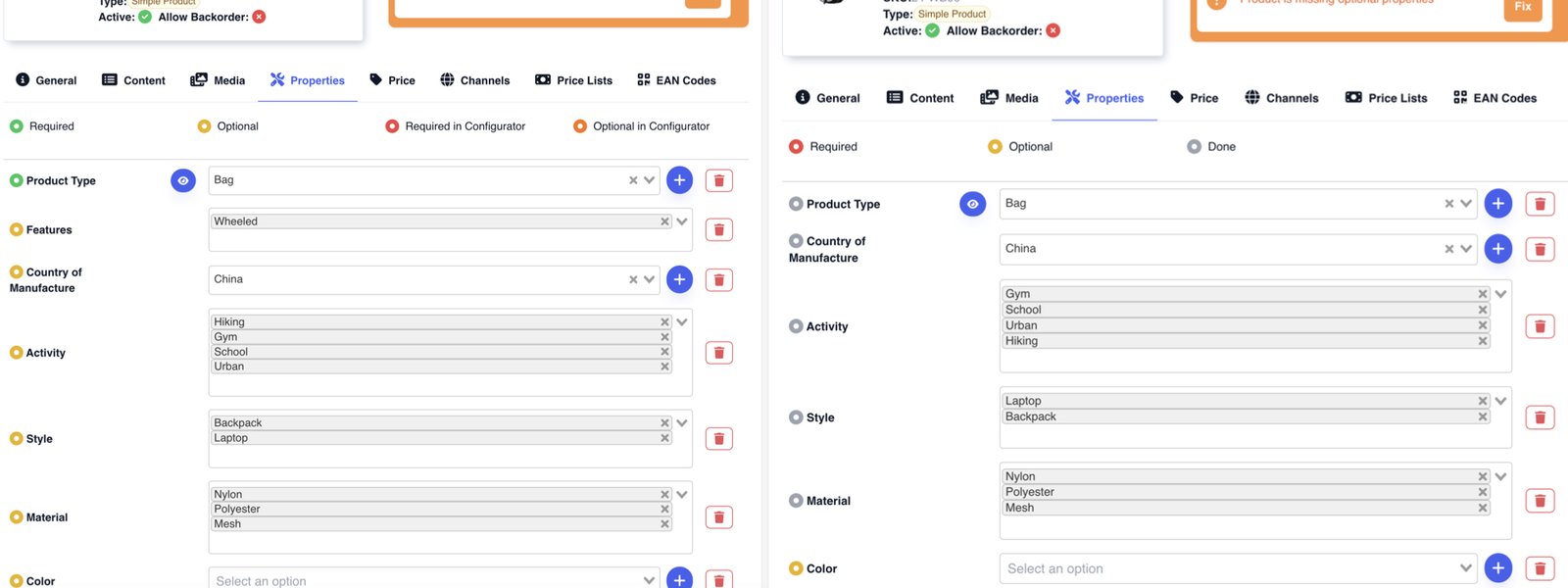
Each property has a different configuration, depending on how important it is:
To communicate this to users, we originally used a color-coded ring system in the UI:
It made perfect sense from a technical perspective. The colors were directly tied to the property rules defined in the backend. But in real-world usage, things weren’t as clear.
The turning point came during a demo with a client. A teammate was walking through the process of filling out product properties. Everything was filled out, or so it seemed. But the product inspector didn’t turn green, indicating something was missing.
Confusion set in. We missed a required property, but with four different colors and no indication of what was already filled, it wasn’t obvious. If even our team was tripping up, it was a signal that the interface wasn’t serving users as well as it could.
We redesigned the color logic around a more intuitive idea: show users only what they need to care about right now.
We reduced the ring colors to just three states:
As soon as a user fills a field, the ring turns grey in real time. Users immediately see what’s left to complete and what’s already done. Hovering over the ring still reveals the full logic (e.g. "required in configurator"), but that information is now secondary, accessible but not overwhelming.
The update took roughly 1.5 hours to implement. It didn’t require building a new feature. It was simply a smarter way to present what was already there.
But the impact was immediate: less friction, more clarity, and a smoother user experience.
Sometimes the best UX improvement isn’t about adding functionality. It’s about making what matters more visible, and hiding what doesn’t until you need it.
We’ll answer your country-specific questions, anything you want to know about how our product works, and provide general advice on e-commerce.